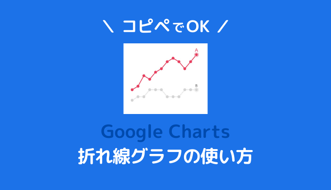

GoogleChartsを使って、WordPressブログに折れ線グラフを埋めこむための方法を解説します。
コピペですぐに使えるデザインを用意していますので、ブログでの用途に合わせてご利用ください。
「どうやってブログに貼り付ければいいかわからない。」
という方は、先にWordPressブログでGoogleChartsを使うための基本をご覧ください。
折れ線グラフは、プロットされた点を線で結んで変化の表したグラフです。
主に時系列などの連続的な変化を読み取るために使います。
伝えたいことを意識して、グラフのデザインを選びましょう。
基本の折れ線グラフ
このグラフのポイント
- Google Chartsの折れ線グラフ(Line Chart)の基本デザイン。
HTML
<div id="line_chart" style="width: 100%; height: 400px;"></div>HTML
<!-- 基本の折れ線グラフ -->
<script type="text/javascript">
google.charts.load('current', {
  packages: ['corechart', 'bar']
});
google.charts.setOnLoadCallback(drawMultSeries);

function drawMultSeries() {
  var data = new google.visualization.DataTable();
  data.addColumn('string', '月');
  data.addColumn('number', 'A社');
  data.addColumn('number', 'B社');
  data.addColumn('number', 'C社');
  data.addColumn('number', 'D社');

  data.addRows([
    ['1', 40, 25, 80, 20],
    ['2', 45, 30, 70, 10],
    ['3', 60, 30, 65, 20],
    ['4', 55, 40, 50, 10],
    ['5', 65, 40, 55, 20],
    ['6', 70, 40, 50, 10],
    ['7', 80, 30, 40, 20],
    ['8', 85, 30, 35, 10],
    ['9', 80, 30, 25, 20],
    ['10', 70, 40, 20, 10],
    ['11', 80, 40, 10, 20],
    ['12', 90, 40, 5, 10],
  ]);

  var options = {
    chartArea: {
      left: 60,
      right: 20,
      top: 40,
      bottom: 60,
      width: '100%',
      height: '100%',
    },
    fontSize: 15,
    lineWidth: 3,
    legend: {
      maxLines: 2,
      position: 'top',
    },
    height: 400,
    hAxis: {
      title: '月'
    },
    vAxis: {
      ticks: [0, 50, 100],
      title: '売り上げ(万円)'
    }
  };

  var chart = new google.visualization.LineChart(
    document.getElementById('line_chart'));

  chart.draw(data, options);
}

</script>
シンプルな折れ線グラフ
このグラフのポイント
- 片方の要素を強調したデザイン。
- 凡例を使わず、注釈機能を使って折れ線のすぐ近くに表示させている。
- できるだけシンプルにするため、縦軸(Y軸)を非表示にしている。
HTML
<div id="line_chart" style="width: 100%; height: 400px;"></div>HTML
<!-- シンプルな折れ線グラフ -->
<script type="text/javascript">
google.charts.load('current', {
  packages: ['corechart', 'bar']
});
google.charts.setOnLoadCallback(drawMultSeries);

function drawMultSeries() {
  var data = new google.visualization.DataTable();
  data.addColumn('string', '月');
  data.addColumn('number', 'Aの価格');
  data.addColumn({
    type: 'string',
    role: 'annotation'
  });
  data.addColumn('number', 'Bの価格');
  data.addColumn({
    type: 'string',
    role: 'annotation'
  });

  data.addRows([
    ['1', 40, '', 25, ''],
    ['2', 45, '', 30, ''],
    ['3', 60, '', 30, ''],
    ['4', 55, '', 40, ''],
    ['5', 65, '', 40, ''],
    ['6', 70, '', 40, ''],
    ['7', 80, '', 30, ''],
    ['8', 85, '', 30, ''],
    ['9', 80, '', 30, ''],
    ['10', 70, '', 40, ''],
    ['11', 80, '', 40, ''],
    ['12', 90, 'A', 40, 'B'],
  ]);

  var options = {
    annotations: {
      stem: {
        // 軸の色
        color: '#fff',
        // 軸の長さ
        length: 10,
      },
    },
    chartArea: {
      left: 40,
      right: 20,
      top: 40,
      bottom: 60,
      width: '100%',
      height: '100%',
    },
    fontSize: 15,
    focusTarget: 'category',
    lineWidth: 3,
    legend: {
      position: 'none',
    },
    height: 400,
    hAxis: {
      title: '',
      textStyle: {
        color: '#666',
      },
    },
    pointSize: 10,
    pointShape: 'circle',
    series: {
      0: {
        annotations: {
          textStyle: {

            fontSize: 20,
            color: '#EA4060',
          },
        },
        color: '#EA4060',
      },
      1: {
        annotations: {
          textStyle: {
            color: '#666',
          },
        },
        lineDashStyle: [2, 2],
        color: '#D5D5D5',
      },
    },
    vAxis: {
      ticks: [],
      title: ''
    }
  };

  var chart = new google.visualization.LineChart(
    document.getElementById('line_chart2'));

  chart.draw(data, options);
}

</script>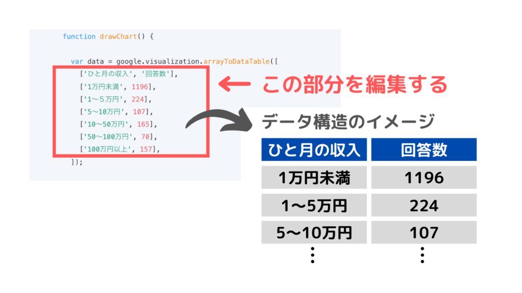
数値データは、「var data = google.visualization.arrayToDataTable([ 〜 ]);」の部分に記載されています。
- データ構造はエクセルのような表のイメージです。
- 1行目はいわゆるヘッダーで、2行目以降がデータになります。
- 入力・編集は原則半角です。全角文字が入るとグラフが表示されなくなりますので、注意してください。
- シングルクォーテーションで囲んだ部分だけは全角を使うことができます。
細かくカスタマイズしたい方のために、折れ線グラフで使用できる全ての設定項目をコードにしました。
項目ごとにコメントをつけています。
折れ線グラフは設定項目が非常に多いです。
コード全体をコピペして、設定項目の値を自分好みに調整してください。
HTML
<div id="line_chart" style="width: 100%; height: 400px;"></div>HTML
<!-- オプションコメントつき折れ線グラフ -->
<script type="text/javascript">
google.charts.load('current', {
  packages: ['corechart', 'bar']
});
google.charts.setOnLoadCallback(drawChart);

function drawChart() {
  var data = new google.visualization.DataTable();

  data.addColumn('string', 'month');
  data.addColumn('number', 'Organic Search');
  data.addColumn({
    type: 'string',
    role: 'annotation'
  });
  data.addColumn('number', 'Social');
  data.addColumn({
    type: 'string',
    role: 'annotation'
  });

  data.addRows([
    ['1月', 336, '', 120, ''],
    ['2月', 416, '', 132, ''],
    ['3月', 486, '', 164, ''],
    ['4月', 632, '', 144, ''],
    ['5月', 855, '', 175, ''],
    ['6月', 1222, 'Organic Search', 200, 'Social'],
  ]);

  var options = {
    // 注釈
    annotations: {
      // 注釈を常に要素の外側に表示する
      alwaysOutside: false,
      // 注釈のボックススタイル
      /*
      boxStyle: {
        // 注釈の枠線の色
        stroke: '#fff',
        // 注釈の枠線の幅
        strokeWidth: 1,
        // 注釈の枠線角のX方向の丸み
        rx: 10,
        // 注釈の枠線角のY方向の丸み
        ry: 10,
        // Attributes for linear gradient fill.
        gradient: {
          // Start color for gradient.
          color1: '#fff',
          // Finish color for gradient.
          color2: '#fff',
          // Where on the boundary to start and
          // end the color1/color2 gradient,
          // relative to the upper left corner
          // of the boundary.
          x1: '0%',
          y1: '0%',
          x2: '100%',
          y2: '100%',
          // If true, the boundary for x1,
          // y1, x2, and y2 is the box. If
          // false, it's the entire chart.
          useObjectBoundingBoxUnits: true
        },
      },
      */
      //
      datum: {
        color: 'black',
        length: 12,
      },
      //
      domain: {
        color: 'black',
        length: 5,
      },
      highContrast: true,
      // 注釈の軸の設定
      stem: {
        // 軸の色
        color: '#fff',
        // 軸の長さ
        length: 10,
      },
      // 注釈のスタイル point,line
      style: 'point',
      // 注釈のテキストスタイル
      textStyle: {
        fontName: 'Arial',
        fontSize: 14,
        bold: false,
        italic: false,
        // 文字色
        color: '#333',
        // 文字の縁取り色
        auraColor: '#fff',
        // 文字の透明度 0~1
        opacity: .9,
      },
    },
    // 軸タイトルの場所 out,in,none
    axisTitlesPosition: 'out',
    // 背景色
    backgroundColor: {
      // 背景の色
      fill: '#fff',
      // 背景の枠線の色
      stroke: '#fff',
      // 背景の枠線の幅
      strokeWidth: 0,
    },
    //チャートエリアの設定
    chartArea: {
      backgroundColor: '#fff',
      left: 60,
      right: 40,
      top: 20,
      bottom: 60,
      width: '100%',
      height: '100%',
    },
    // 要素の色
    colors: ['#038EC7', '#50B432', '#ED561A', '#EDEF00'],
    // 十字線
    crosshair: {
      color: '#000',
      // フォーカス中の十字線の設定
      focused: {
        color: '#ccc',
        opacity: 0.5,
      },
      // 表示する縦線横線を設定 'both','vertical','horizontal'
      orientation: 'vertical',
      // 選択した十字線の設定
      selected: {
        color: '#f66',
        opacity: 0.5,
      },
      // 十字線を表示するトリガー 'focus','selection','both'.
      trigger: 'both',
    },
    // 曲線か直線か 'function','none'
    curveType: 'none',
    // 要素の透明度 0~1
    dataOpacity: 1,
    // インタラクティヴィティの設定
    enableInteractivity: true,
    // エクスプローラ機能の設定
    explorer: {
      // 操作を設定 dragToPan,dragToZoom,rightClickToReset
      actions: ['dragToZoom', 'rightClickToReset'],
      // 操作できる方向を設定 vertical,horizontal
      axis: 'horizontal',
      // データ範囲を超えないように設定する
      keepInBounds: true,
      // ズームインできる最大値
      maxZoomIn: .25,
      // ズームアウトできる最大値,
      maxZoomOut: 4,
      // ズーム操作の変化量
      zoomDelta: 1.5,
    },
    // フォーカスする対象 datum,category
    focusTarget: 'category',
    // グラフ内の全てのフォントサイズ
    fontSize: 15,
    // グラフ内の全てのフォントファミリー
    fontName: 'sans-serif',
    // 横項目軸(X軸)の設定
    hAxis: {
      // 軸の方向 1,-1
      direction: 1,
      // フォーマット ex decimal,percent,currency...
      //format: 'HH:mm',
      // グリッドラインの設定
      gridlines: {
        color: '#fff',
        count: -1,
        minSpacing: 40,
        multiple: 1,
        units: {
          years: {
            format: []
          },
          months: {
            format: []
          },
          days: {
            format: []
          },
          hours: {
            format: []
          },
          minutes: {
            format: []
          },
          seconds: {
            format: []
          },
          milliseconds: {
            format: []
          },
        },
        interval: [1, 2, 2.5, 5],
      },
      ticks: {},
      // テキストの位置 out,in,none
      textPosition: 'out',
      // テキストスタイル
      textStyle: {
        fontName: 'Arial',
        fontSize: 14,
        bold: false,
        italic: false,
        // 文字色
        color: '#666',
      },
      // 横軸のタイトル
      title: '',
      // 横軸のタイトルのテキストスタイル
      titleTextStyle: {
        fontName: 'Arial',
        fontSize: 14,
        bold: false,
        italic: false,
        // 文字色
        color: '#666',
      },
      allowContainerBoundaryTextCutoff: false,
      // 横軸のテキストが収まらないときに斜めにするかどうか
      slantedText: false,
      // 横軸のテキストを斜めにした場合の角度
      slantedTextAngle: 30,
      // 横軸ラベルの重なりレベル
      maxAlternation: 2,
      // テキストラベルの最大行数
      maxTextLines: 2,
      // 横軸ラベルの最小間隔
      minTextSpacing: 10,
      // 横軸ラベルを表示する数
      showTextEvery: 1,
      // 横軸の最大値
      // maxValue:100,
      // 横軸の最小値
      // minValue:0,
      // 横軸の表示範囲モード pretty,maximized,explicit
      viewWindowMode: 'pretty',
      // 横軸のトリミング範囲
      /*
      viewWindow: {
        min: [7, 30, 0],
        max: [14, 30, 0]
      },
      */
      // 【continuousのみ有効な設定】
      // ベースライン
      baseline: 1,
      // ベースラインの色
      baselineColor: '#333',
      // 対数目盛を使うかどうか
      logScale: false,
      // 対数目盛のタイプ
      scaleType: null,
      // マイナーグリッドラインの設定
      /*
      minorGridlines: {
        color: '#333',
        count: -1,
        minSpacing: 40,
        multiple: 1,
        units: {
          years: {
            format: []
          },
          months: {
            format: []
          },
          days: {
            format: []
          },
          hours: {
            format: []
          },
          minutes: {
            format: []
          },
          seconds: {
            format: []
          },
          milliseconds: {
            format: []
          },
        },
        interval: [1, 2, 2.5, 5],
      },
      */
    },
    // グラフの縦の大きさ
    height: 400,
    // 欠落点の値を推測するかどうか
    interpolateNulls: false,
    // 凡例の設定
    legend: {
      // 凡例の最初に表示するページ
      pageIndex: 0,
      // 凡例の位置 bottom,left,in,none,right,top
      position: 'none',
      // 凡例の表示位置 start,center,end
      alignment: 'start',
      // テキストスタイル
      textStyle: {
        fontName: 'Arial',
        fontSize: 14,
        bold: false,
        italic: false,
        // 文字色
        color: '#333',
      },
    },
    // 破線のパターン
    lineDashStyle: [3, 1],
    // 要素の太さ
    lineWidth: 3,
    // チャートの向き horizontal,vertical
    orientation: 'horizontal',
    // ポイントのサイズ
    pointSize: 10,
    // ポイントの形 ’circle', 'triangle', 'square', 'diamond', 'star', or 'polygon'
    pointShape: 'circle',
    // ポイントの表示
    pointsVisible: true,
    // 要素を逆方向に描画する
    reverseCategories: false,
    // 要素の選択はひとつか複数か 'single','multiple'
    selectionMode: 'multiple',
    // 要素ごとの設定
    series: {
      0: {
        annotations: {
          textStyle: {
            bold: true,
            color: '#038EC7',
          },
        },
        color: '038EC7',

        curveType: '',
        labelInLegend: '',
        lineDashStyle: [2, 2],
        lineWidth: 3,
        pointShape: '',
        pointSize: 12,
        pointsVisible: true,
        // 第2軸を使うか
        targetAxisIndex: 0,
        visibleInLegend: true,
      },
      1: {
        annotations: {
          textStyle: {
            color: '#50B432',
          },
        },

        color: '#50B432',
      },
      2: {
        annotations: {
          textStyle: {
            color: '#ED561A',
          },
        },

        color: '#ED561A',
      },
      3: {
        annotations: {
          textStyle: {
            color: '#333',
          },
        },

        color: '#EDEF00',
      },
    },
    // テーマ 現在は一つのみ 'maximized'
    theme: '',
    // グラフのタイトル
    title: '',
    // グラフタイトルの位置 in,out,none
    titlePosition: 'none',
    // グラフタイトルのテキストスタイル
    titleTextStyle: {
      fontName: 'Arial',
      fontSize: 20,
      bold: false,
      italic: false,
      color: '#333',
    },
    //マウスオーバーで表示されるツールチップの設定
    tooltip: {
      //表示する情報 both,value,percentage
      text: 'both',
      textStyle: {
        color: '#878787',
        fontName: 'Arial',
        fontSize: 15,
        bold: 'false',
        italic: 'false',
      },
      //ツールチップを表示するタイミング focus,none,selection
      trigger: 'focus',
      //ツールチップに要素色のアイコンを表示する
      showColorCode: 'true',
      //HTMLツールチップを使う
      //isHtml: 'true',
      //HTMLツールチップのみ反映
      //ignoreBounds:'false',
    },
    /*
    // トレンドラインの設定
    trendlines: {
      0: {
        type: 'linear',
        color: 'green',
        lineWidth: 3,
        opacity: 0.3,
        showR2: true,
        visibleInLegend: true
      }
    },
    */
    // 垂直軸が2つある場合は vAxes:{0:{},1:{}}
    // 垂直軸の設定
    vAxis: {
      // 軸の方向 1,-1
      direction: 1,
      // フォーマット ex decimal,percent,currency...
      //format: 'HH:mm',
      // グリッドラインの設定
      gridlines: {
        color: '#ccc',
        count: -1,
        minSpacing: 40,
        multiple: 1,
        units: {
          years: {
            format: []
          },
          months: {
            format: []
          },
          days: {
            format: []
          },
          hours: {
            format: []
          },
          minutes: {
            format: []
          },
          seconds: {
            format: []
          },
          milliseconds: {
            format: []
          },
        },
        interval: [1, 5],
      },
      // マイナーグリッドラインの設定
      minorGridlines: {
        color: '#ccc',
        count: 0,
      },
      ticks: {},
      // テキストの位置 out,in,none
      textPosition: 'out',
      // テキストスタイル
      textStyle: {
        fontName: 'Arial',
        fontSize: 14,
        bold: false,
        italic: false,
        // 文字色
        color: '#666',
      },
      // 縦軸のタイトル
      title: '',
      // 縦軸のタイトルのテキストスタイル
      titleTextStyle: {
        fontName: 'Arial',
        fontSize: 14,
        bold: false,
        italic: false,
        // 文字色
        color: '#666',
      },
      // 縦軸の最大値
      // maxValue:1000,
      // 縦軸の最小値
      // minValue:0,
      // 縦軸の表示範囲モード pretty,maximized,explicit
      viewWindowMode: 'pretty',
      // 縦軸のトリミング範囲
      /*
      viewWindow: {
        min: 0,
        max: 1000
      },
      */
    },
    // グラフの幅 固定しないため使わない
    //width: 500,
    // 【マテリアルチャートのみ有効な設定】
    // タイトルとサブタイトル
    chart: {
      title: '',
      subtitle: '',
    },
  };

  var chart = new google.visualization.LineChart(document.getElementById('line_chart'));
  chart.draw(data, options);
}


</script>棒グラフ以外のグラフの使い方やデザイン集は、以下の記事をご覧ください。
 WordPressブログにグラフを埋めこむためのGoogleChartsの使い方